

Microsoft PowerPoint
Microsoft Corporation
I usually judge a productivity app by what happens between the first idea and the finished result. Microsoft PowerPoint is strongest when that journey ends with a presentation someone else can understand, edit, and present without needing me beside them. I tested it as a mobile presentation tool rather than treating it as a smaller desktop replacement, and that distinction matters. On a phone or tablet, it is most useful for shaping an idea, checking a deck, making urgent corrections, and handing work forward. It is less comfortable when the entire presentation must be designed from scratch on a small screen.
Developed by Microsoft Corporation, this free productivity app is available to everyone and has become a familiar choice for school, work, training, and personal projects. Its store profile shows a 4.8 average from around 3.9 million ratings, with over 1 billion installs. Those figures make sense to me: PowerPoint is not trying to be a niche presentation experiment. It is the mobile version of a tool many people already encounter when a meeting, class, or client request ends with “Can you send the slides?”
From a rough idea to a usable presentation
Starting with the real problem, not a blank slide
A realistic PowerPoint session often begins away from the app. I may have a few notes from a meeting, a list of points for a lesson, or a collection of photos that need a clear story. The difficult part is not opening a new file; it is deciding what the audience should remember. PowerPoint helps once that decision has been made, but it does not remove the need for structure.
Related News

The quickest way to get moving is to treat the first version as an outline. Instead of choosing decorative elements immediately, I start with a sequence: the situation, the important evidence, the recommendation, and the next step. This approach works particularly well with the app’s Copilot experience, which is designed to help generate an outline and get a presentation started. I find that useful for escaping the blank-page problem, but I would still review every suggested point before showing the deck to anyone.
That review is important because an outline can sound complete while still missing the detail that makes a presentation trustworthy. I use generated structure as a starting conversation with myself: Is the order logical? Does each slide have one job? Is the conclusion actually supported by what came before it? The app can accelerate the first pass, but my judgement remains responsible for the final message.
Related News

Why WhatsApp Messenger Still Makes Everyday Communication Feel Easy

Jurassic World: The Game Is the Better Dino Tycoon for Strategic Players

Threads in Real Life: Who Should Join, Lurk, or Leave

How SHEIN Turned Shopping Into an Endless Content Feed

How to Make Fortnite Feel Smarter on Mobile

Should You Switch to Microsoft Outlook on Mobile?
A practical mobile workflow
My preferred workflow begins with a short outline and a deliberately small number of ideas. I create the opening slide only after deciding what the audience needs to know first. Then I build the middle around evidence or explanation, leaving the final slide for a decision, summary, or clear action. This prevents a common mobile-editing mistake: spending time adjusting fonts before the story is settled.
Once the structure exists, I add text in short blocks rather than copying whole paragraphs from notes. Long text may be easy to paste, but it is difficult to read during a presentation and awkward to edit on a touchscreen. PowerPoint is much more manageable when each slide contains a focused thought. If a sentence needs several lines to explain itself, I ask whether it belongs in speaker notes or in a separate slide.
On a tablet, arranging content feels closer to a traditional presentation workflow. On a phone, I use larger controls, zoom carefully, and avoid making delicate layout changes while travelling. A phone is excellent for correcting a heading, replacing an image, or checking whether a slide looks broken. It is not my first choice for repeatedly dragging several objects into exact alignment.
Gallery
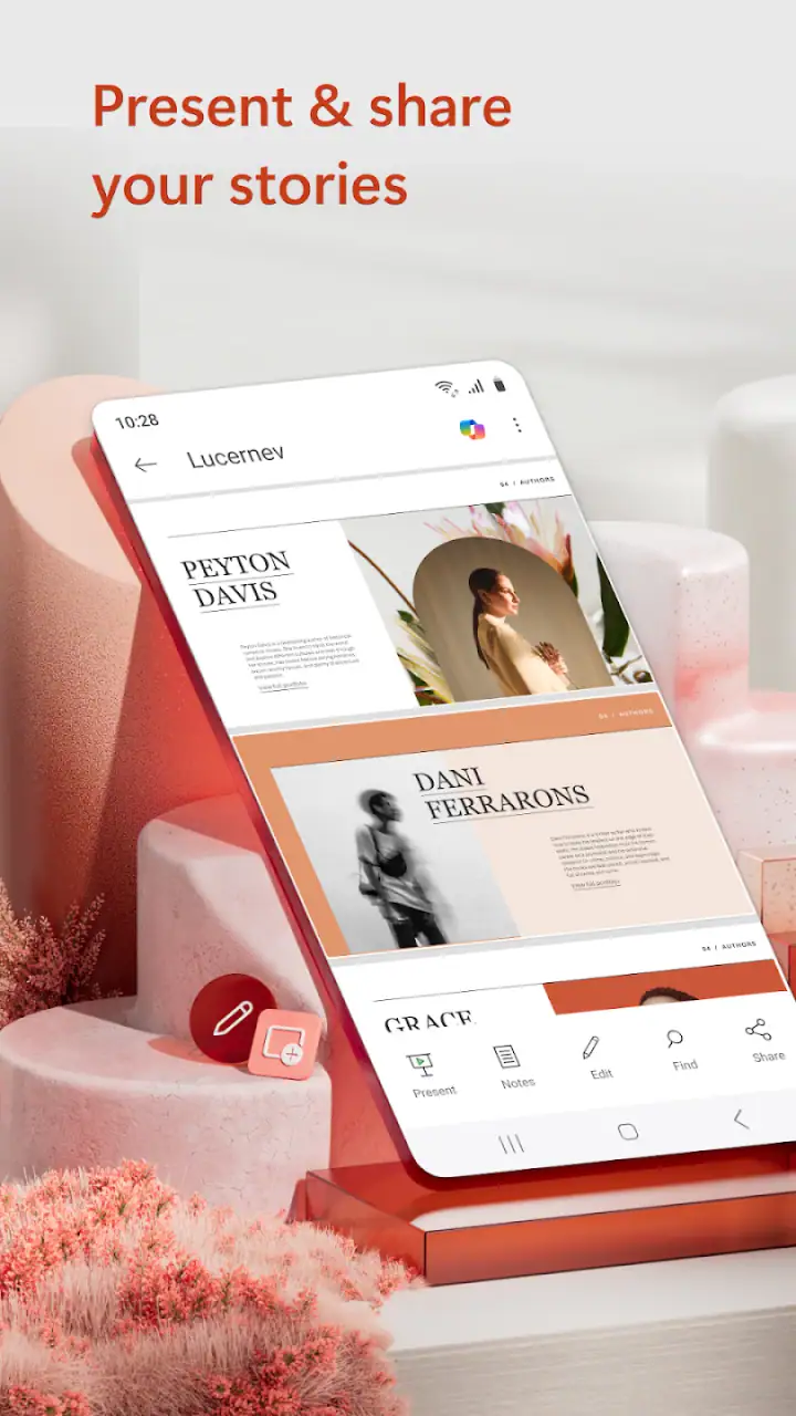
One useful habit is to make a rough visual pass before polishing. I look for slides that are much denser than the others, headings that do not follow the same pattern, and images that compete with the message. This catches problems that a spellcheck will never find. A presentation can be grammatically perfect and still feel confusing because the visual order is inconsistent.
Turning content into a coherent deck
PowerPoint’s familiar slide-based approach is both its advantage and its constraint. The advantage is that I can think in separate moments: opening, explanation, comparison, decision, and close. The constraint is that every new idea can tempt me to add another slide instead of simplifying the original one.
I get better results when I use repeated visual rules. For example, I keep the same position for slide titles, reserve one area for supporting detail, and avoid changing the basic arrangement without a reason. This is not about making every slide identical. It is about reducing the mental work required from the audience. The app gives me room to experiment, but consistency is what makes the finished deck feel intentional.
Images deserve special attention. A picture can explain a process faster than several lines of text, but it can also introduce distraction or make the file harder to handle. I choose visuals that answer a question: What does this show? Why is it here? If I cannot answer quickly, the image is probably decoration rather than communication.
Tables and dense charts are another point where I slow down. They may be useful as working material, yet a mobile screen makes small labels especially easy to overlook. I prefer to highlight one comparison and move supporting detail elsewhere. If the audience needs to inspect every cell, a document or spreadsheet may be a better companion than forcing the entire analysis into one slide.
Handoffs between devices and people
The most valuable part of a mobile presentation app is often the handoff. I might begin a deck on a computer, review it on a phone, and make a final correction before a meeting. In another situation, a colleague sends a draft, I adjust the wording, and the file returns to the original owner for approval. PowerPoint fits these exchanges because the presentation format is widely recognized and easy for many recipients to understand.
Before handing over a file, I check more than the text. I run through the slides in presentation order, look at the first and last slide, and inspect any page that contains a crowded image or unusually small wording. I also confirm that the intended presenter can follow the argument without my private explanation. A deck that only makes sense to its creator is not ready for delivery.
When several people contribute, naming and version discipline become more important than clever design. I keep a clear working copy and avoid making major structural changes immediately before someone else presents. A small wording correction is easy to explain; a rearranged sequence can create confusion if the presenter has already rehearsed.
This is where PowerPoint compares well with simpler presentation alternatives. A basic slide creator may feel faster for a quick visual announcement, while a document editor may be better for a long written briefing. PowerPoint is the stronger fit when the outcome needs a sequence of visual points, a recognizable presentation format, and a handoff to someone who may continue editing on another device.
At the same time, I would not choose it automatically for every collaborative project. If the work depends on several people editing a highly visual canvas at once, another tool may feel more natural. If the content is mainly paragraphs and references, a document is less restrictive. PowerPoint earns its place when the audience benefits from pacing and visual separation, not simply because the file extension is familiar.
The result: what the audience actually receives
A successful PowerPoint workflow ends with more than a saved file. It ends with a presentation that tells the audience where they are, why the information matters, and what they should do next. The app supports that outcome by keeping the work organized as slides rather than leaving the message as a loose collection of notes.
I especially value the ability to review the deck from the audience’s point of view. I ask whether the opening gives enough context, whether the middle earns the conclusion, and whether the final slide leaves a useful next step. This review often leads me to delete material. Mobile editing makes that decision surprisingly practical because the smaller screen exposes slides that are overloaded with detail.
For a student, that may mean turning research into a presentation with a clear argument rather than reading an essay aloud. For a manager, it may mean converting meeting notes into a short decision deck. For a trainer, it can mean arranging instructions into stages that are easier to follow. For a small business owner, it may mean preparing a proposal while away from a desk and then refining it later on a larger screen.
The app is also a sensible choice for people who already receive PowerPoint files regularly. Familiarity reduces the friction of opening a deck, understanding its structure, and returning edits in a format others expect. That practical compatibility is more important to me than novelty. A presentation tool does not need to reinvent slides if it helps me finish the work reliably.
Where the workflow breaks down
The first weakness appears when I try to do precision design on a phone. Touch controls are convenient for quick changes, but repeated resizing, alignment, and text selection can become tiring. I would rather create the basic structure on a computer or tablet, then use the phone for review and urgent adjustments. Anyone expecting a full desktop design experience in a pocket should lower that expectation.
The second weakness is the temptation to confuse speed with quality. Copilot can help me form an outline quickly, but a fast outline is not automatically a strong argument. It may need fact-checking, local context, better examples, and a more natural voice. I treat it as an assistant for momentum, not as an editor who understands my audience.
There can also be friction when a presentation contains complicated layouts, extensive data, or many visual elements. Small changes may affect the balance of a slide, and a deck that looks acceptable in editing mode still deserves a full presentation review. I never rely only on the thumbnail view for an important meeting.
Cost is another practical consideration. The app itself is free, while in-app purchases range from $0.99 to $129.99 per item. That means I would check which capabilities are available in the setup I plan to use before building a workflow around them. For occasional edits, the free entry point is appealing. For professional use, the total value depends on the features and services required for the specific account and working environment.
The age rating is Everyone, which matches the broad nature of the tool. Still, suitability is not the same as simplicity. A child can open a slide project, but producing a clear presentation still requires planning, reading, and visual judgement. Beginners may benefit from starting with a short deck instead of attempting a large school or work project immediately.
Small techniques that improve the finished deck
One technique I recommend is separating the “working deck” from the “presenting deck.” In the working version, I may keep extra evidence, alternate wording, or backup slides. Before delivery, I create a cleaner path for the audience. This prevents useful research from crowding the main story while preserving material I may need during questions.
A second technique is to inspect transitions between slides rather than judging each slide alone. I read the final line of one slide and the title of the next. If the connection feels abrupt, I either revise the title or change the order. This catches a subtle problem: individual slides can be well designed while the overall presentation still feels like disconnected cards.
A third technique is to use the phone as a rehearsal checkpoint. I open the deck when I am not sitting at my desk and try to explain each slide in one breath. If I need a long explanation that is not visible in the deck, I mark the slide for revision. This is a useful test because it reveals whether the presentation supports the speaker or merely stores information.
I also keep a close eye on the opening minute. The first slide should not make the audience guess why they are there. A specific title and a short framing statement usually help more than a decorative cover. PowerPoint gives me enough flexibility to make that opening polished, but the content decision has to come first.
Who should use it, and who should look elsewhere?
I recommend Microsoft PowerPoint to students, office workers, teachers, presenters, and anyone who regularly needs to turn an idea into a sequence of visual explanations. It is particularly useful if presentations arrive from other people, move between devices, or need to be edited close to the time of delivery. The huge installed base also makes the format a practical common language in many settings.
I would be more cautious for someone who wants a purely collaborative whiteboard, a design-first canvas, or a writing environment with no slide constraints. Those users may feel slowed down by the page-by-page structure. I would also steer away from making the phone the only device for a complex, highly polished deck. The app can support that project, but the screen and controls may turn straightforward design into tedious work.
After using it through the complete path from rough notes to handoff, my view is positive but specific. PowerPoint is not magic, and its mobile version is not a replacement for every desktop task. Its real strength is continuity: I can start with an outline, shape a visual argument, check the result away from my desk, and pass the presentation to another person in a familiar form.
The app is free to install, comes from Microsoft Corporation, and has been available since Jan 6, 2015. With an Everyone content rating and a 4.8 average supported by millions of ratings, it is an easy recommendation for mainstream presentation work. My main advice is to use it for communication first and decoration second. If you keep the story focused, use Copilot as a starting aid rather than a final authority, and reserve detailed layout work for a larger screen when possible, Microsoft PowerPoint becomes a dependable part of the journey from scattered input to a presentation people can actually use.
FAQs for Microsoft PowerPoint
What are the key features of Microsoft PowerPoint on mobile devices?
Microsoft PowerPoint for mobile devices offers a range of features including the ability to create, edit, and view presentations. Users can access a variety of templates, collaborate in real-time with others, and insert images, videos, and charts. The app also supports cloud storage integration, making it easy to save and access presentations anywhere.
Is Microsoft PowerPoint free to use on Android and iOS?
Microsoft PowerPoint is available as a free download on both Android and iOS devices. However, access to premium features requires a Microsoft 365 subscription. The free version allows basic functionality like viewing and editing presentations, but more advanced tools and collaboration features are included with a subscription.
Does Microsoft PowerPoint support offline access to presentations?
Yes, Microsoft PowerPoint allows users to access and edit presentations offline. Once you download a presentation to your device, you can work on it without an internet connection. Any changes made will sync to the cloud once you're back online, ensuring your updates are saved and accessible across devices.
Can I collaborate with others using Microsoft PowerPoint on mobile?
Absolutely. Microsoft PowerPoint supports real-time collaboration, allowing multiple users to work on a presentation simultaneously. You can share a link to your presentation with team members, and they can view or edit it as needed. This feature is especially useful for teams working remotely or across different locations.
What file formats are compatible with Microsoft PowerPoint mobile app?
Microsoft PowerPoint mobile app supports several file formats, including PPT, PPTX for presentations, and PDF for exporting documents. It also allows importing of images and media in formats like JPEG, PNG, and MP4. This versatility ensures compatibility with various devices and software, making it a robust choice for presentation needs.
Pros
- Intuitive user interface for all skill levels.
- Wide range of templates for quick setup.
- Seamless integration with Microsoft Office.
- Collaborative features for team projects.
- Cloud storage support for easy access.
Cons
- Requires a Microsoft account for full features.
- Limited design flexibility compared to advanced tools.
- Occasional performance issues on older devices.
- Subscription needed for premium features.
- Mobile version lacks some desktop functions.


